In part 1 of this series, we asked the question about
getting value and results out of an ERP implementation or optimization. In this
part I’d like to present the tools and analytics we apply to assess a current
situation in terms of productivity, efficiency, automation and inventory
performance.
Naturally, if one wants to improve an unsatisfactory
situation, one must have a clear picture of the current situation. We need to
know where we stand before we can think about activities to improve and better
our positions. But what are the Key Indicators which tell us how we perform?
One of the key measures in production is ‘flow’. When
materials and orders don’t flow, they cause long lead times, high levels of
Work in Process, bad fill rates and constant re-scheduling is required. To
generate flow is why capacity planning and production scheduling is done in the
first place. If you don’t do it right, it is impossible to flow the orders
through the shop floor. And since a lot of companies (at least many I worked with)
don’t use their ERP system effectively to generate a periodic schedule, there
are a lot of shop floors out there which don’t flow well.
So how can you measure the degree of flow you have on your
shop floor? I recommend reading Factory Physics (by Spearman and Hopp) from
which I borrowed what I believe is an excellent method: flow benchmarking. With
flow benchmarking you can determine how well your production is using inventory
to deliver high Throughput and short Cycle Times. Flow benchmarking uses Little’s
Law to relate Revenue (Throughput) with average Inventory holdings (WIP) and
Lead Times (or Cycle Times) and provides an excellent opportunity to calculate
a third variable when two are measurable. It shows how well materials flow and
is an brilliant tool to set a WIP cap in a pull system.
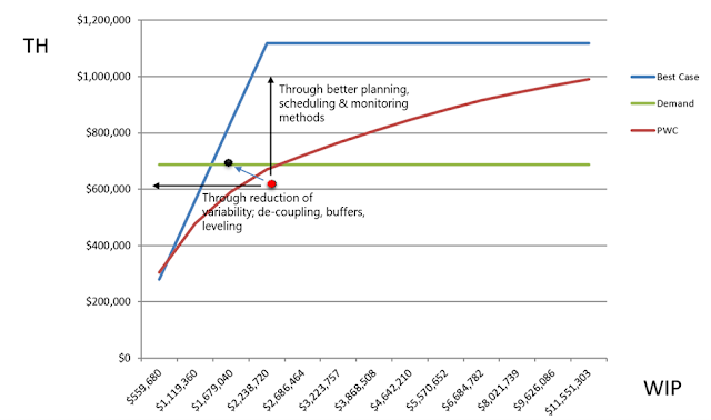
In the example provided, we can see that the shop floor is
currently operating in the bad zone (the red dot) which is below the Practical
Worst Case (PWC). In fact, they require approximately 2 million worth of work
in process to deliver an output worth just above 600k. That output however,
does not cover the demand of 640k. In short, they’re consuming too much
inventory, to achieve an output which doesn’t even cover demand. We can also
see that capacity is not the problem. The maximum capacity available is defined
by the blue line. (flow benchmarking also includes the Lead Time, which is not
shown in the example)
What we should deduce from this measure, is that we must
move the dot to the left and up. That would move us into the lean zone, where
we start generating more output with less input (WiP). How can you do that?
Reducing variability through the correct setting of de-coupling points and
using buffers moves the dot to the left, and the implementation of better
planning and scheduling will move the dot upward.
Another important measure we must get clarity about is our
ability to fulfill customer demand. This measure should focus not only on fill
rates or service levels, but also on how flexible we can react to changing
demand patterns. I’ve seen many variations of this KPI, with many different
input and output parameters. In the end, what counts is how happy your
customers can be with the reliability of your delivery. Of course, there are
limits as to how much variability in demand you can swallow. Therefore, you
must lay down some rules so that everyone – up and down the supply chain – has
clarity about what to expect. This includes a clear definition about what you
offer right from stock and what you offer to an order with a predetermined lead
time the customer must accept.
Consequently, we measure service level (or fill rate for
MTS) separately for MTS from MTO. This sounds simple and logical, but I’m often
surprised that when I ask planners which parts they classify as MTS and which
ones as MTO, they can’t give me a clear answer.
Another important aspect in the measurement of service is to
know how much variability we add ourselves. “Why would we add variability to an
already noise-laden process” you might ask. Well, you certainly don’t add
variability on purpose, but it happens through a myriad of ineffective ways.
Deterministic planning, unnecessary deep Bills of Material, incorrect use of
de-coupling points and the lack of clearly defined rules are just a few
practices that add deteriorating variability into the process.
That is why we also like to measure possible sources of inefficiencies, so that we can device solutions which reduce noise and increase productivity. Like in the following example, we have analyzed the product structure and how it was built into the ERP (BoM, routings, inventory and scheduling points)
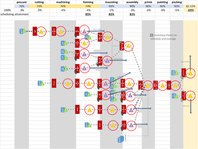
As can be seen in above graphic, the more inventory and
scheduling points there are, the more variability can (and will) occur. And
every time there is variability, the system degrades, leaving you with bad fill
rates in the end.
Of course, there are many more KPIs, like fill rate or
service level, inventory measures and utilization which I cannot sufficiently
cover in a blog post, but if I may make one recommendation here: don’t evaluate
the KPI’s separately. Always look at them in the context of the other and the
big picture. Sometime one KPI is in direct conflict with another (e.g. the
desire for high resource utilization is in direct opposition with flow when
variability is present).
Naturally, the more clarity you’ll get out of the analysis,
the better your position for improvement.
Getting Value and Results out of an ERP 1
Getting Value and Results out of an ERP 3
No comments:
Post a Comment
Note: Only a member of this blog may post a comment.